10+ Fresh Color Ideas for the Kitchen to Cook in Style
The kitchen is where meals are prepared, conversations are had, and memories are made. That’s why you need some great color ideas for the kitchen to make sure it looks and feels just the way you want it to. One way to do that is by choosing the perfect scheme.
It’s important to choose tones that make you feel happy, relaxed, and inspired. Here’s a collection of some of our favorite combinations that you can try out.
1. Classic White
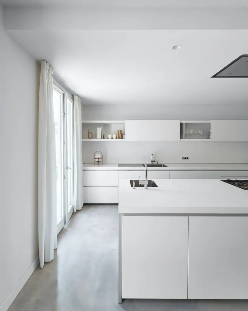
A timeless classic, white is a popular choice for paint ideas for the kitchens. It creates a clean, crisp and refreshing look that can make any space feel bigger. It also works well in small areas as it can help to create the illusion of more space. Since it’s a great neutral base that can be paired with any other hue to create a beautiful contrast, none of your appliances will look out of place. Be it your gray metallic refrigerator or a brown microwave — everything goes!
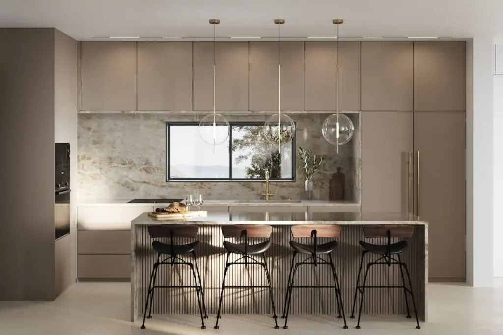
2. Neutral Tones
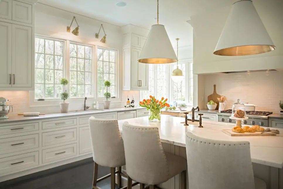
Neutral shades like gray, beige, and taupe can create an inviting and warm feel. They also provide a great backdrop for colorful accents. You can use them to create a sense of calm and balance. Color scheme ideas for the kitchen that employ neutral shades usually look more sophisticated and graceful than bolder alternatives like red or maroon, making them a safe choice for any home. On top of all that, neutral tones are easy to match with other paints and patterns, which means it’d be super simple to change up the room’s look without having to repaint the walls.
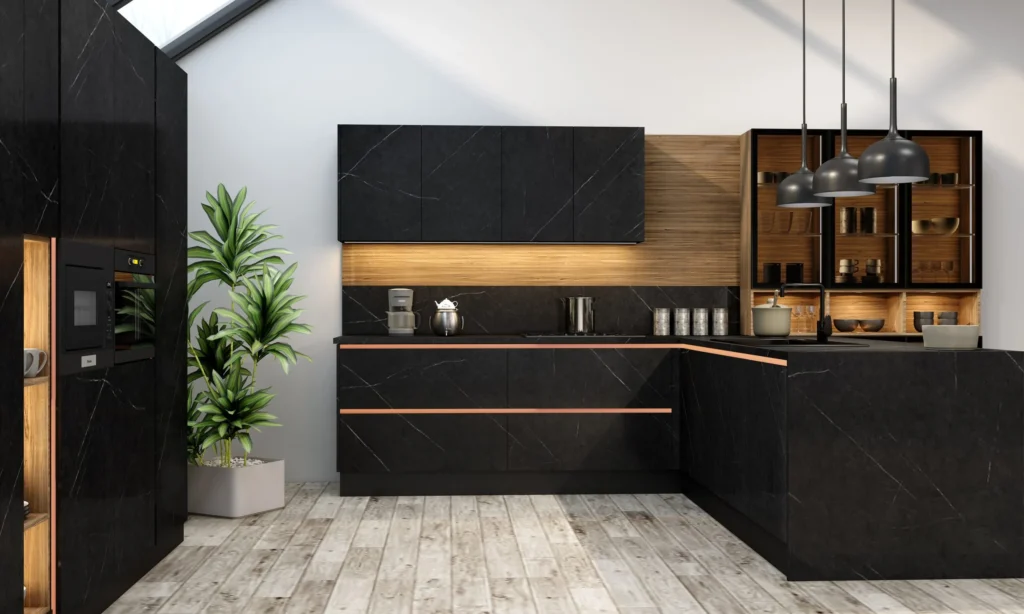
3. Black and White
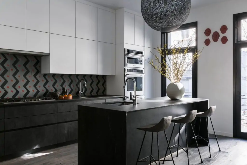
Black-and-white color ideas for kitchen cabinets and walls can add a touch of subtle charm to your decor. This combination is ideal for folks who love a more modern aesthetic. It’s a timeless classic that never goes out of style. Even though it’s the opposite of “colorful,” a black-and-white theme effortlessly creates a sense of drama and contrast, making it an excellent choice if you want to make a bold statement without using any bright shades.
4. Blue and White
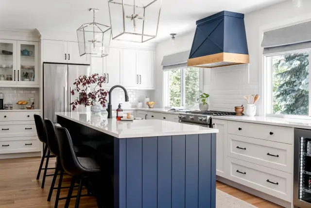
These two colors work well together to create a coastal or nautical feel. They are really perfect for beach lovers! If you’re one of them, why not bring some of those oceanic vibes into your decor?
Blue is a soothing color that can create a sense of tranquility in the space. And let’s be honest, all kitchens can use a relaxing element to offset the chaos that sometimes goes on in there. But generally, this is one of those paint color ideas for kitchen walls and cabinets that is impossible not to like.
5. Yellow and Gray
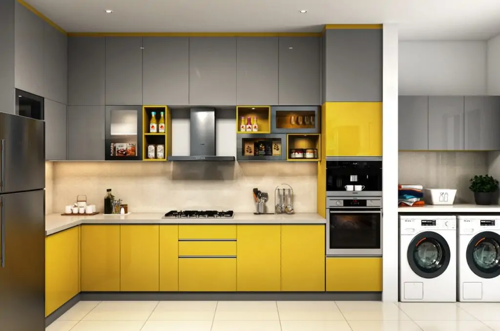
A yellow and gray scheme can create a sunny, cheerful look. Yellow is known to be an appetite stimulant, which makes it truly ideal for your color ideas for painting kitchen cabinets. What’s more, being a warm shade, yellow also creates a sense of energy and positivity in the space. Gray, though, is a neutral shade that helps offset the warmth of yellow, which means these two colors work incredibly well to brighten up the place while still looking perfectly balanced.
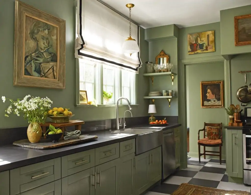
6. Green and White
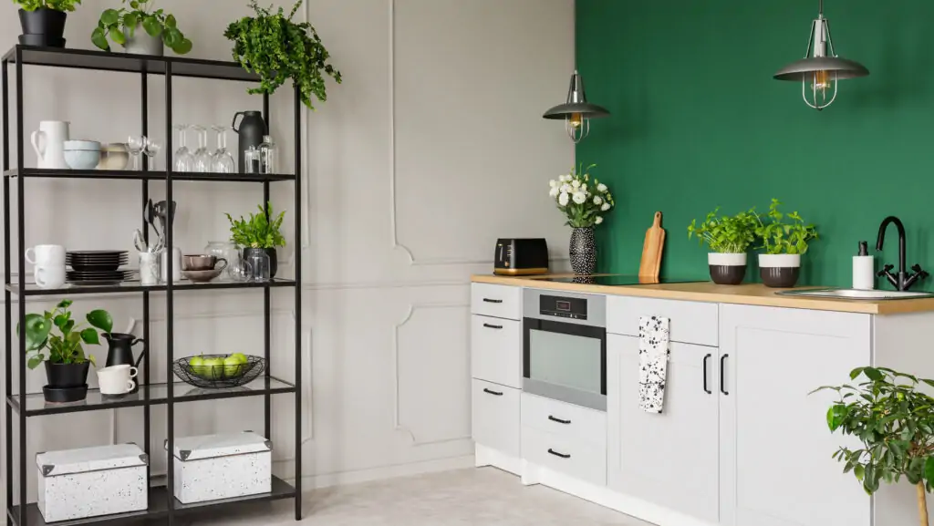
This color scheme offers a fresh, organic vibe — which, if you think of it, is very fitting for a place where you cook. But aside from being the color of veggies, green is a soothing shade that reminds you of nature, making it a great choice.
White, on the other hand, is literally the definition of neutral, which can help balance out the richness of green.
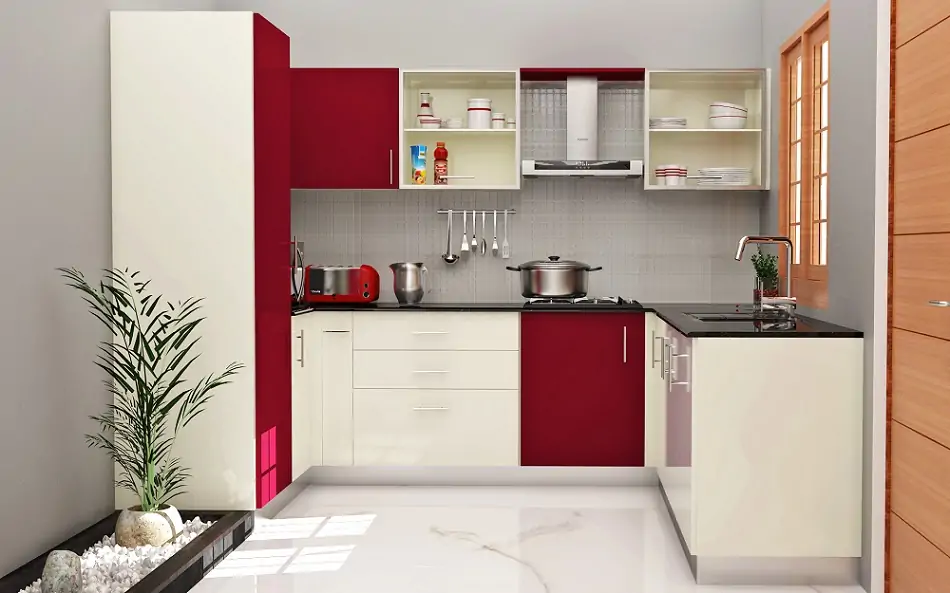
7. Red and White
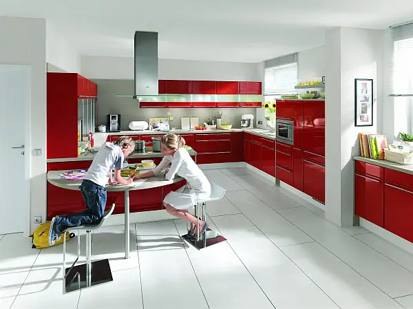
A red and white color scheme in your kitchen reflects a classic vintage look that can work pretty well if executed properly. Red is a bold hue that can add a lot of energy to a space. It’s also a pretty warm shade, and it’s known for inciting a sense of passion and enthusiasm from a psychological standpoint. White, however, is the perfect candidate to tone things down a notch while still taking full advantage of the sheer punchiness of red.
Without being paired with it, red would generally look tacky because it’s so easy to overdo it. So, there aren’t many promising options to use with red besides white, as it effortlessly balances out the red’s boldness.
8. Purple and White
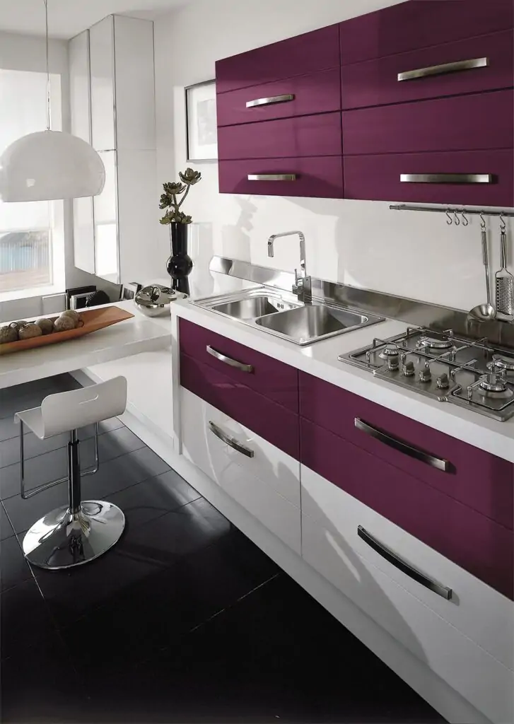
This color scheme is pretty unique and is certainly one of our favorites (mostly because of just purple). You get to create a regal, elegant look in your interior design with this gorgeous combination. Purple looks rich and luxurious and adds a touch of glamor to any space. White tones things down a bit, making this combination easier on the eyes.
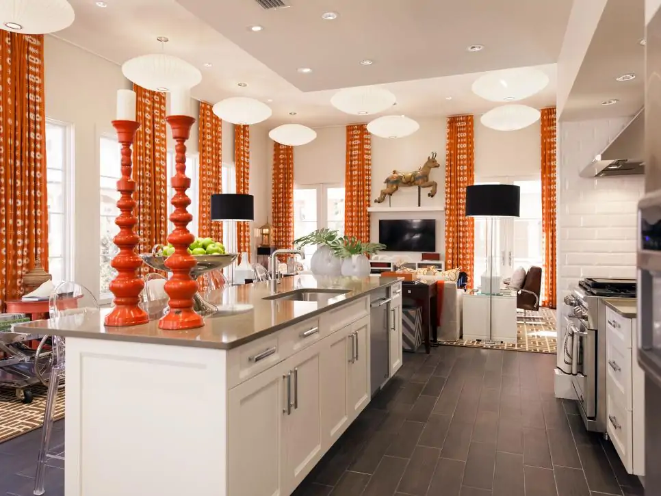
9. Orange and White
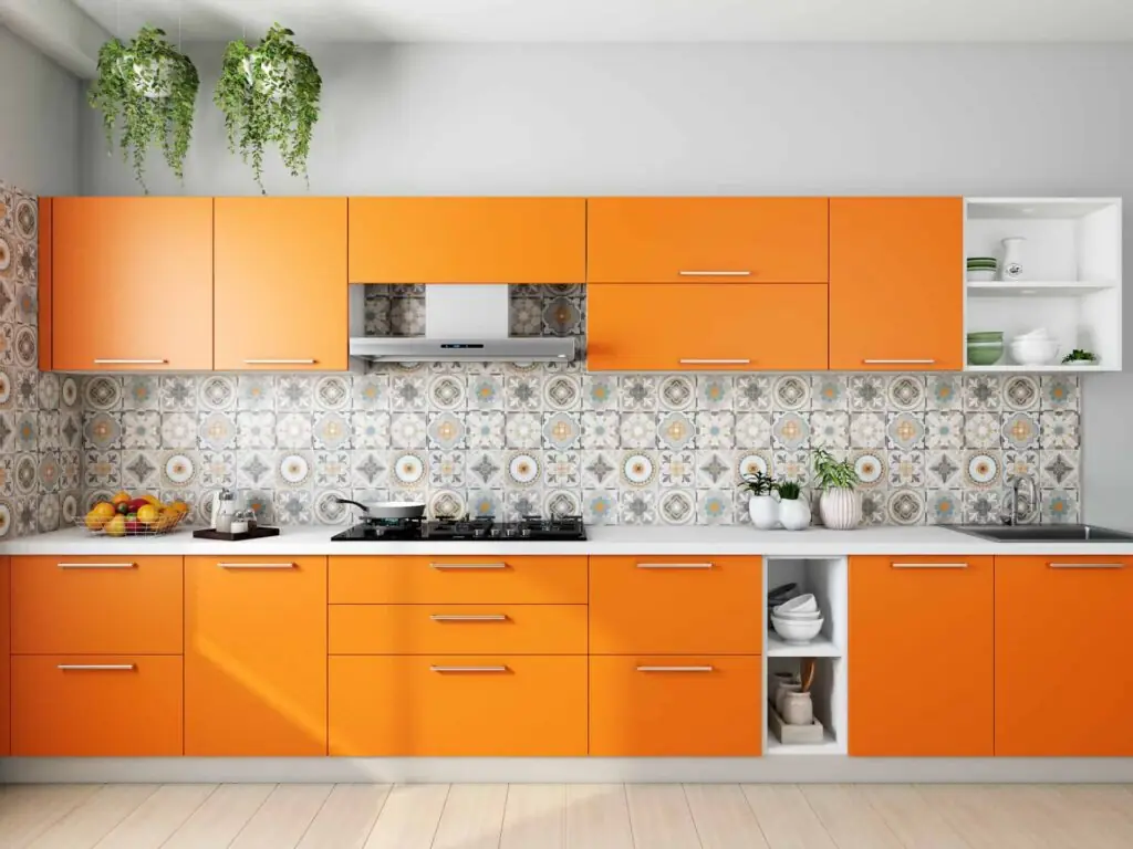
An orange and white scheme is one of the truly irresistible color combinations for kitchen cabinets if you aim to create a fun, vibrant look in the kitchen. The warmth of orange adds a lot of energy and vibrance to a space, making it a great choice for those who want to create a sense of excitement and enthusiasm. White, once again, acts as a neutralizer here to balance out the brightness of orange.
10. Brown and White
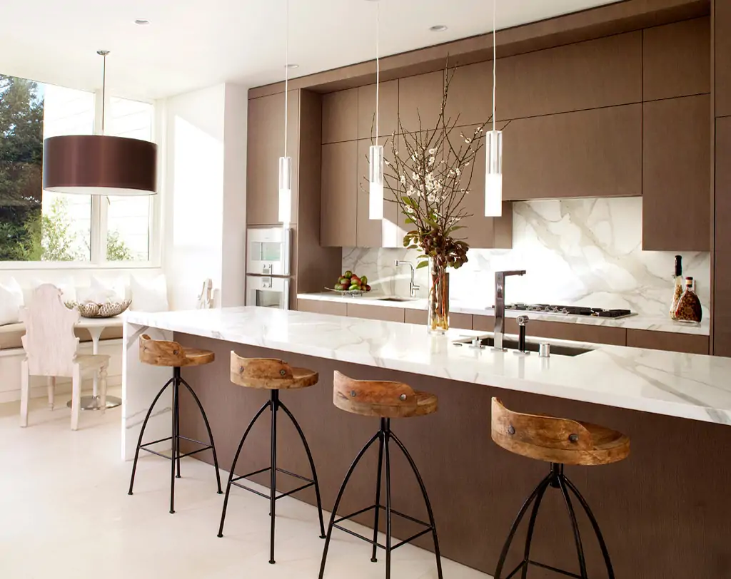
A brown-and-white scheme can create a cozy, rustic look. Brown is a natural color that reminds you of the outdoors, and it effortlessly creates a warm and comforting vibe. You can pair it with another soothing shade like sage green to really embrace the nature vibes. You can even throw in a few houseplants to add to the aesthetic! But remember to either get fake ones or choose houseplants that don’t mind higher levels of humidity because you can’t really avoid that in the kitchen.
Honorable Mentions
Having covered the classic kitchen color ideas in our top 10 list above, let’s now look at a few unconventional combos that work well together if you’re looking to try something new!
Pink and Gold
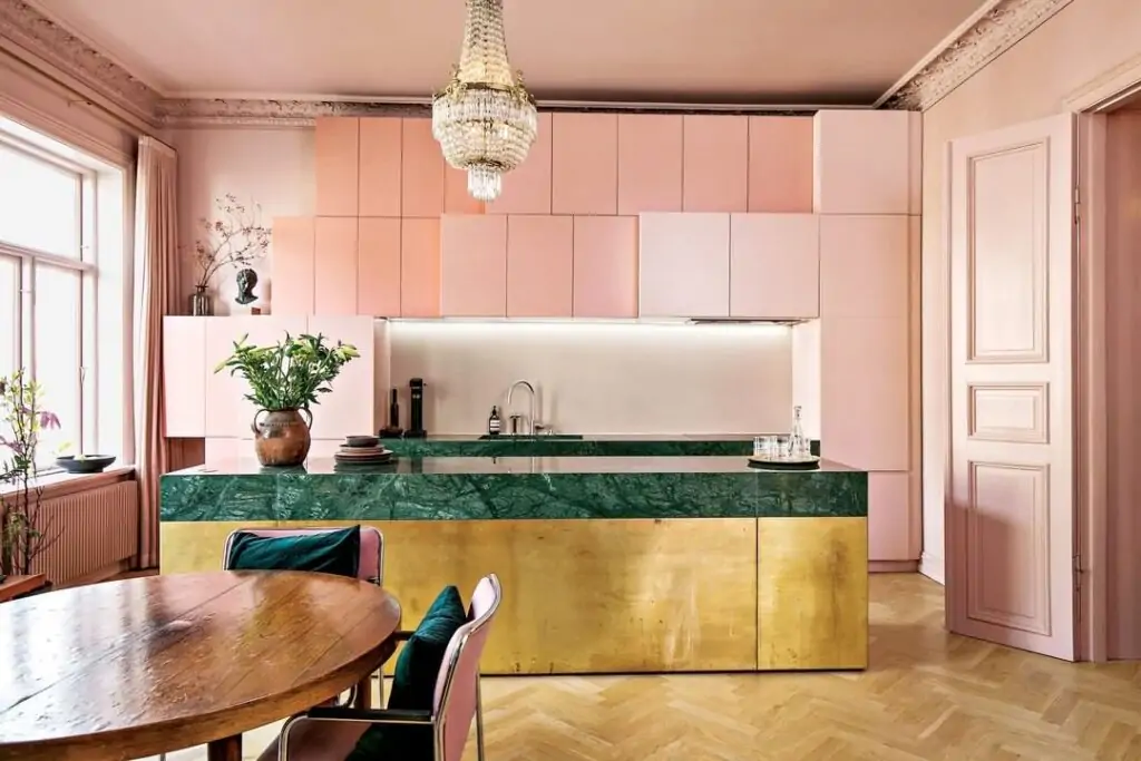
This scheme creates a feminine, elegant, and luxurious feel in the kitchen. Being a warm and inviting shade, pink can evoke feelings of joy and happiness, while gold is the staple of luxury. If you’re afraid that it might look a bit too tacky or bold, you can always go with a pastel shade of pink that’s slightly lower profile but still provides a similar vibe.
Black and Gold
Looking for a sleek, modern, and sophisticated feel in the kitchen? You can’t go wrong with black and gold. Black is a timeless color that will add a dramatic touch and contrast. Gold, in turn, will make the entire setting look luxurious and high-end, so feel free to go with this combination if that’s the vibe you’re going for. Still, this scheme works best in larger areas, so if you are looking for color ideas for a small kitchen, you might want to choose something lighter for your limited space.
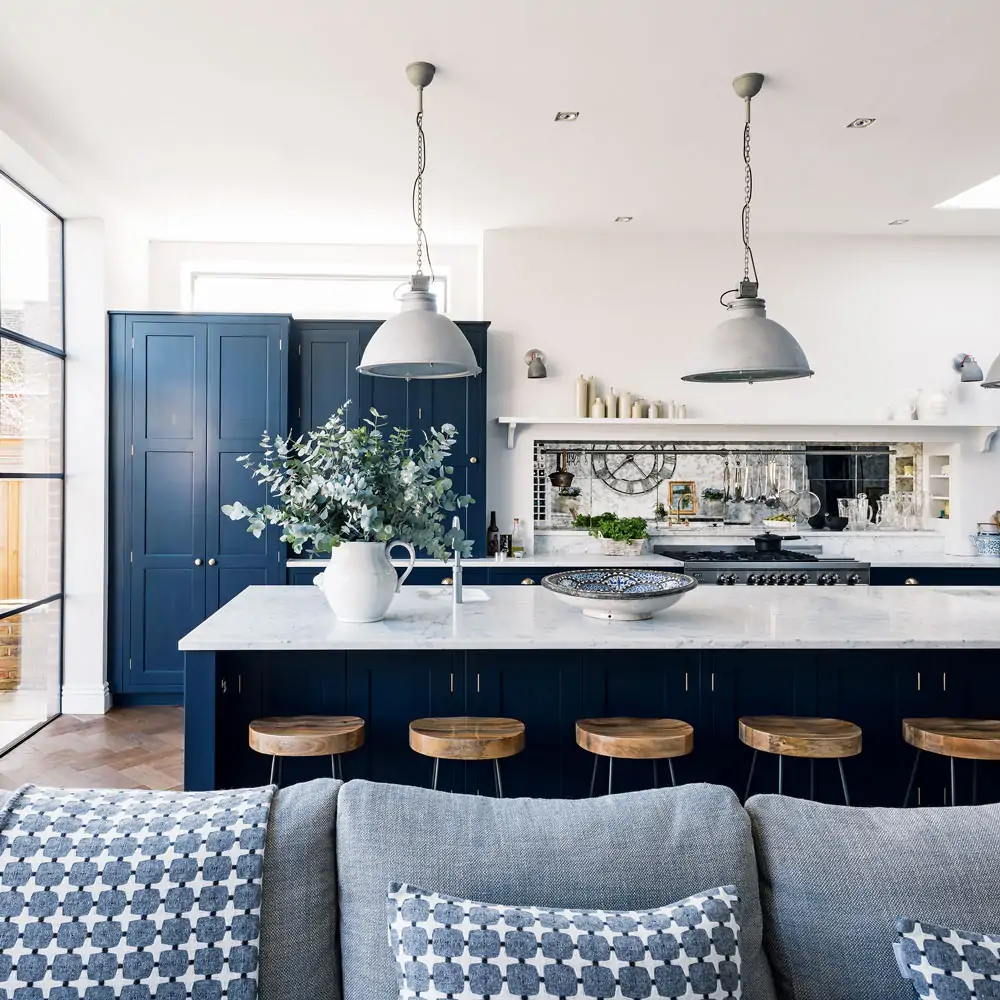
This color scheme creates a nautical, coastal and elegant feel in the kitchen. Navy is a classic shade that introduces a sense of sophistication and elegance without even trying, while white evens out the navy’s richness.
Burgundy and Cream
This color scheme creates a warm, cozy, and inviting feel. Burgundy is a rich and warm color that can add a sense of passion and energy, while cream color acts as its neutralizing counterpart.
Rust and White
Ever noticed a noticeably warm and welcoming vibe in some people’s homes? Next time you feel that way, look for colors like yellow, rust, or brown because they’re the shades that are generally responsible for creating this feel.
Rust is a warm and earthy color that can remind you of nature, so pair it with white, and you’ve got a winning combo that’ll make your guests feel right at home!
Color Schemes to Avoid in Your Kitchen Decor
When it comes to kitchen decor, there are definitely some combinations that you’ll want to avoid if you don’t want the place to look like a hot mess.
First of all, stay away from using black and brown together. These shades are both pretty dark on their own, and when you put them together, they can make your space feel like a dungeon. You want it to be a bright and cheerful space, not a place where you’re always reaching for a flashlight.
Another combo to avoid is red and orange. These two are both pretty bold and can be overwhelming when used together. Plus, they can create a feeling of heat and discomfort, which is the last thing you want in a room where you’re cooking.
Yellow and green are also a no-no. They can clash and create a jarring look: it’s like wearing a neon green shirt with bright yellow pants.
Lastly, a combination of blue and purple is also not advisable in your cooking area. When used together, they tend to make the space feel cold and uninviting, and it’s not exactly the vibe you’re going for when you’re making dinner.
It’s always a good idea to stick with neutral hues as a base and add some accents. This way you can be sure that your kitchen will look cohesive and put-together. And if you’re not sure what colors to use, you can always consult a designer or an interior decorator for professional suggestions that are tailored to your particular space.
Conclusion
In conclusion, these are just a few of the many color ideas for the kitchen that you can use to give your cooking space a look and feel you want. No matter what shades you choose, remember to let your personal style shine through with them! Also, be sure to pick paint ideas that make you feel happy, relaxed, and inspired.